An app designed to motivate Millennial and Gen Z adults to read for fun.
Role: Product Designer
Timeline: 10 weeks
Tools: Figma, InVision, Google Meet
Platform: iOS Native app

Brief
As a part of the Capstone Project, I was tasked with identifying, planning, researching, and designing a digital mobile interaction that addresses a problem space of my choosing, using the tools and techniques of User Experience Design.
Why Readful?
In exploring potential problem spaces, I considered the idea of leisure reading or reading for fun. I was an avid reader as a child, but as I went away to college and began my professional career I found I was reading less and less and wished I could do something about it. After talking with some of my peers, I found others were in similar situations. I decided this would be a great area of opportunity, especially because there aren't currently any digital products filling this niche.

Problem Space
Only about half of American adults have read a book in the past year, with millennials and Gen z reading less than any other generation, despite all of the benefits that can be reaped from leisure reading such as relieving stress, improving cognitive function, and increasing empathy.
Top reasons adults give for not reading more are not having enough time, not wanting to pay for books, and not knowing what to read.
Process
I used the 6-step Design Thinking Process as a framework due to the flexibility and iterative nature it offers. Since I set out to create an end-to-end digital solution, I knew I'd need a lot of room for exploration and moving fluidly throughout the process as I worked with users and had assumptions validated and disproven during various phases of the project.

Empathize
Research Objectives:
-
Learn about millennials' and Gen Z adults’ habits and attitudes towards reading for fun.
-
Learn about why Millennials and Gen Z read for the amount that they do.

Key Research Insights
Benefits of Reading

Relieves Stress
by increasing enjoyment and relaxation

Builds Empathy
by learning about others who are different from you

Improves Cognitive Function
by increasing concentration and working memory
Source: George Mason University
Primary Research
After doing contextual research, I conducted primary research with potential target users.
I conducted 5 interviews with the following participant criteria:
Millennial or Gen Z adult
Not an "avid*" reader
*defined as reading 50+ books per year
Attempted to read at least 1 book in the last 12 months
-
Age group that reads the least
-
Age group with the heaviest mobile app usage
-
Would benefit from a digital solution for reading habits
-
Don't already have a robust reading routine in place
-
Shows any interest in reading, even if small
-
May be interested in a digital solution to improve their current reading patterns
Key Themes
Time
Users don't have the time or don't want to spend the time to develop a reading habit
Money
Users don't mind spending money on books, but would avoid/limit if they can
Curation
Users can't find something that they're interested in reading or holds their interest
Opportunity Selection
From my initial hypothesis...
I began the process of user interviews with the hypothesis that users would say they didn’t read because they didn't know what to read. That was somewhat true, but not the strongest theme
To my gathered insights...
Through the process of user interviews, the theme that emerged most strongly was people wanting to read but not feeling they had the time, attention, or motivation to do so (regardless of their actual situation.)
Users mostly said they didn't have a place in their schedule for reading. I dug deeper to think about if that was fully accurate or just their perception, and how could I work with that.
"There's only so much time in the day."
“I spend too much time on my phone.”
“I get lazy because I don’t have a good habit of reading.”
The key theme was...
I decided to rename this theme “Perceived Time” because in most cases they actually would have the time to read (especially if they chose to forgo tv/social media), but chose not to.
HMW motivate Gen Z adults and millennials to read for leisure more frequently in order to reap the benefits?
Persona
The Persona exemplifies the “perceived time” theme in a relatable identity as a lens through which I began to imagine a digital solution.
About the persona
-
Doesn’t have many life responsibilities outside of her job and home chores
-
Finds herself thinking she doesn't have enough time to leisure read
How can Readful help?
-
Motivate her with an external force (Readful) to reframe her perceived time and find that she can meet her reading goals
-
Focus on building a habit around reading for fun so that she will prioritize it and not be distracted or tempted by other things

Define
User Stories
After discovering in research that users had a desire to read more despite taking actions, I asked myself:
What would reframe mindset and motivate users?
I called the core epic I landed on Goal-Setting.

Validating the Epic
I did additional secondary research to validate my assumption that goal-setting would be a strong driver for motivation.
It turns out it is, especially with the following considerations:
-
ensure that the goal is attached to a value
-
frame the goal as an asset to be gained rather than a threat to be avoided
-
setting a learning goal instead of a performance goal
Source: Psychology Today

The task flow I developed involves the user starting a challenge based on their reading goal and updating it with their progress.
Task Flow
UI Inspiration
When ideating about ways to motivate users through goal-setting, I looked for inspiration in apps that had challenge components, including:
-
Headspace
-
Fitbit
-
Duolingo
These products have highly engaging challenge features, so I wanted to learn from their building blocks
-
Various challenges with descriptions and details
-
Progress tracking
-
Social Sharing


Competitive Analysis
I also analyzed possible competitors:
-
Bookly
-
👾 Indie Developer, smaller audience
-
✅ Professional and approachable UI
-
❌ Does not have recommendations
-
-
Goodreads
-
👾 Mainstream, owned by Amazon
-
✅ Clean and intuitive layout
-
❌ UI, Challenges, and Recommendations can use improvement
-
-
StoryGraph
-
👾 An emergingly popular app
-
✅ Robust and high quality recommendations
-
❌ UI is overly minimal
-

Ideate → Prototype
Sketching & Wireframing
With my UI inspiration in mind, I moved on to sketching and initial wireframes.
I started with Sharpies and a sketchbook, then transferred the strongest ideas to an iPad sketch to refine.
From there, I created mid-fidelity black-and-white wireframes that would have core functionality necessary for Usability Testing.

Rapid Ideation
Design priorities
-
Minimalist aesthetic
-
Familiar patterns


Design Rationale
Challenge Library

For the challenge libraries, I went with cards separated into categories. Each card has the minimum amount of information necessary to still be effective for easy scanability.
Challenge Settings

I initially used pickers and sliders in my sketches but later switched to a number input in the mid-fidelity design to allow for greater precision and efficiency.
Test
I conducted 2 rounds of 5 user testings each via Google Meet with my Figma Prototype.
I gave users the following goals and observed and prompted them to see if they were able to complete my predetermined tasks.
Goal:
I want to read 50 pages this week.
Tasks:
-
Start a New Challenge
-
Enter Constraints
-
Log Pages Read
-
Review Progress

While testers generally didn’t have major issues completing the goal at hand, the main areas for improvement were in building user confidence and decreasing user confusion.
Feature Prioritization
After each round of testing, I sorted and compiled my notes to create a feature prioritization matrix to determine which changes should be made, and which should be pushed to a future sprint.

Design Evolution
Implement
Branding
I had some general ideas for the look and feel of the app that I expanded upon and ideated on using some of the following tools:
-
More A than B
-
Keywords
-
Mood Board


Look & Feel
The feeling I wanted to procure was of an elementary school library or book fair-- the bright colors and retro tones that would bring back fond memories and excitement towards books and reading that one had as a child.

Building Blocks
Colors
I selected bright colors extracted from my mood board based on visibility, visual interest, and adherence to the overall brand. Once I had narrowed them down to four brand colors, I hue-balanced them and selected a range of tints.

UI Library
I chose IBM's Carbon icons for their minimalism and retro feel.
Some key design elements are:
-
Challenge in progress card - at a glance see information and progress
-
Challenge Setup and Progress Input modal - precisely and efficiently enter information that will be immediately displayed
-
Book Buddies - delightful branded characters sprinkled throughout for a branding feel and encouragement


Accessibility
I ensured that my color palette was accessible at a AA minimum WCAG contrast standard using the Able Figma Plug-in.
I also adhered to recommended touch targets for iOS with an absolute minimum of 44 x 44 but larger whenever possible.


Final Product
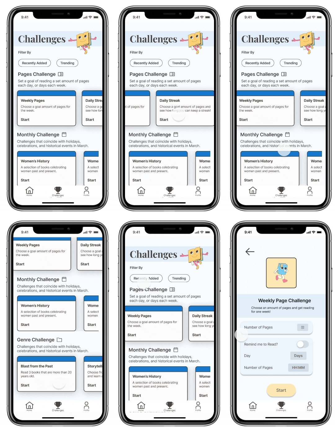
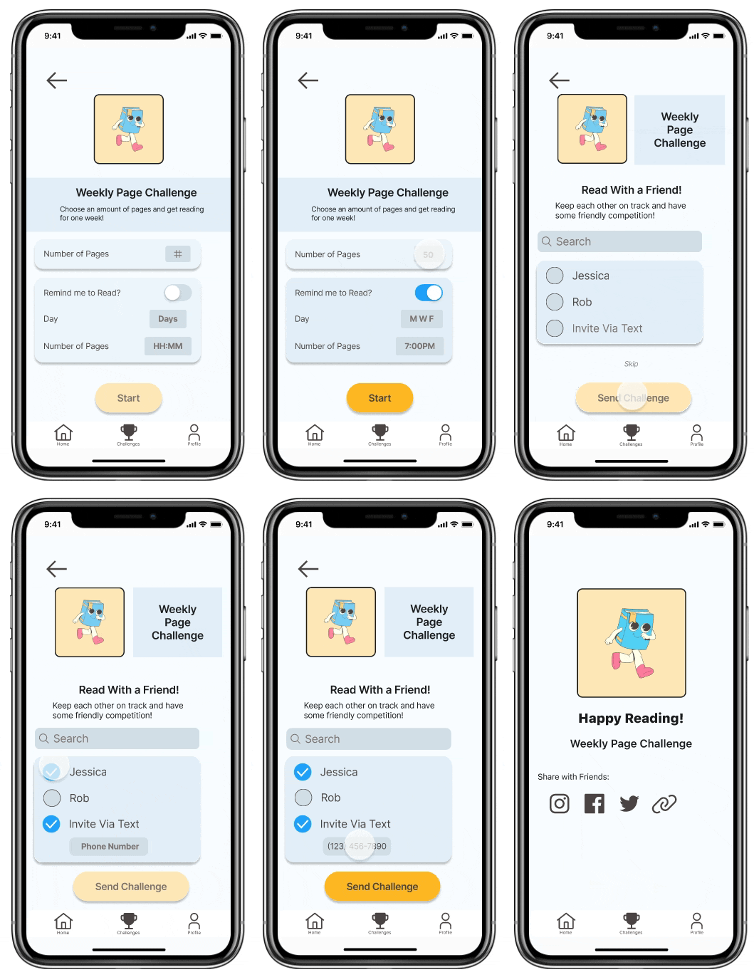
My high-fidelity prototype takes the user through 3 main phases:
1. Create a new challenge from the challenge library
2. Input challenge customization settings
3. Log progress as you read
1. Create a new challenge from the challenge library


2. Input challenge customization settings

3. Log progress as you read
Design Impact
By focusing on design, Readful can create a memorable and enjoyable experience for its users, which can lead to increased usage and greater success in achieving its mission of helping users establish a reading habit.

Future Considerations
Using the Tarot Cards of Tech as an exercise, I brainstormed some future considerations with a few of my colleagues.
-
The BFFs - how does the product enhance or detract from a friendship
-
Keep things light and encouraging
-
Offer option to keep track of friends and follow along
-
Enhance social function for sharing accomplishments and reading together
-
-
The Siren - what does using the product "too much"look like?
-
Find a balance because we do want readers on the app to build their habit
-
Remind readers actually to read, not just browse the app
-
Key Learnings
-
The importance of user research: Designing an app requires a deep understanding of the target users, which can inform design decisions and ensure the app meets the users' expectations.
-
The significance of a well-defined user flow: Designing a seamless user flow is critical for ensuring users can easily navigate and accomplish their goals within the app.
-
The importance of testing and iteration: Testing allows designers to identify issues and areas for improvement, which can then be addressed through iterations until the app is ready for launch.
-
The significance of accessibility: Incorporating accessibility features into the design can make the app more inclusive and enhance the overall user experience.

